UX/UI Designer
With a naturally empathic personality, the theories and thoughts about human centered design really resonates with me. Designing with the sole purpose of making the user feel comfortable and still be able to excel in a specific task is an exciting design challenge.
Identifying problems, creating solutions, creating an ideation, user testing and reiteration is a workflow that I feel I thrive at and uses cross disciplinary skills from other projects I have worked on. In addition to the back end of user experience, I have the design chops to make real prototypes look good and functional using Adobe XD and Figma.
HealthyEats App
Role: Inventor/Creative Director/UX & UI Designer
Project Summary:
HealthyEats is an app that helps plan, schedule, shop for and prepare healthy meals. It is a recipe database with photos of every recipe. It breaks down the ingredients needed and gives you an opportunity to add them to a shopping list which can be exported to Instacart and other grocery store shopping platforms.
Approach:
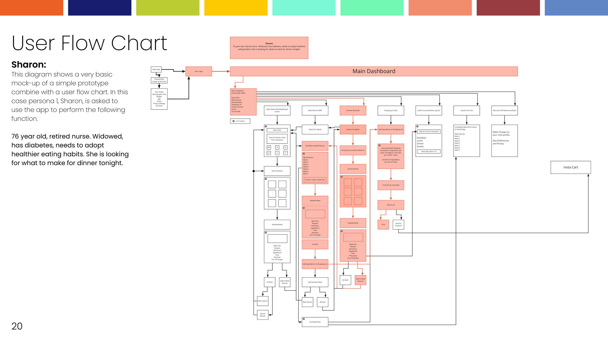
I started working on this app by doing research. I wanted to determine if there was already an app out there that offers the same features that I wanted to have. Next, I created user personas and performed a survey of my target audience. The answers from my questionnaire as well as the user personas helped me develop how the app would function. After I organized all of my data, I developed a comprehensive flow chart and wireframed protype and did user testing. Based on the user testing I then created the final prototype. Finally, I did the first iteration UI design then the final UI design.
Services:
Branding
UX & UI Design
Programs/Skills:
Adobe XD
Figma
Photoshop
Illustrator


DLBjewelry.com
Role: Creative Director/UX & UI Designer
Project Summary:
DLBjewelry.com is a small locally owned business that sells one-of-a-kind jewelry and handmade gifts. This is a brand new business and an entire package that includes - logo, branding, original photography, social media campaigns, printed materials and a website were needed.
Approach:
I wanted to establish the color palette first. The colors were important because the jewelry itself is very colorful. I stuck with a simple colorful palette of red, magenta, green, blue, cyan and yellow on a bright white background. This established a lot of the visuals for the branding. In addition to the visual elements, I worked on the voice and feel. Next was the style of photography. After a lot of playing, I discovered that shooting the jewelry on a white sweep with hard sunlight gave me the look I desired. The last step was the website. By using the styles established with the branding look, feel and voice I created an Adobe XD website prototype. It consists of a landing page, jewelry collections pages, jewelry detail, shopping cart and check out.
Services:
Branding
Logo Design
Website Design
Photography Style
Programs/Skills:
Adobe XD
Photoshop
Illustrator

